[ad_1]
The Nothing Phone (1) will be available on open sale starting today. Apart from the unique transparent design, the phone also comes with an Android skin called Nothing OS, which is supposed to offer an experience similar to stock Android. While the skin is clean and bloat-free, it still needs to work on polishing some aspects and fixing some bugs, like the app Pop-Up View feature, which doesn’t work as expected. However, Nothing OS can get much better with a few small feature additions to the interface.
Here are five feature additions we’d love to see in a future Nothing OS update.
Page Contents
One-tap toggles in quick settings
One of the eye-catching UI features of Nothing OS is the new look of the top two toggles in the Quick Settings panel. The Internet and Bluetooth toggles turn into larger circles when you completely pull down the panel and quick swipes on the internet toggle will let you switch between mobile data, WiFi and hotspot settings.
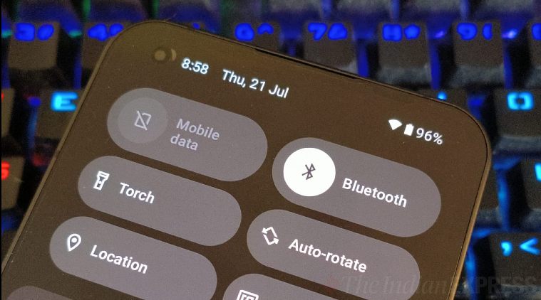 One-tap toggles for data, WiFi and Bluetooth are much more usable. (Express Photo)
This is really handy, except that these individual data, hotspot and WiFi toggles aren’t one-tap. As a result, pressing on all three of them brings you to the same little page that pops-up from the bottom of the phone, where you need to then manually turn data, WiFi and hotspot on or off. Adding a single-tap mechanism to the main quick settings toggles would save all of us users that extra, unnecessary tap.
Better ‘Clear all’ button in recent apps
The Nothing phone (1) is available with either 8GB or 12GB RAM, and with the clean Android skin on board, it’s safe to say that the phone can handle plenty of apps at the same time without any issues. However, this becomes a hassle pretty quickly when you want to clear all your recent apps in one go.
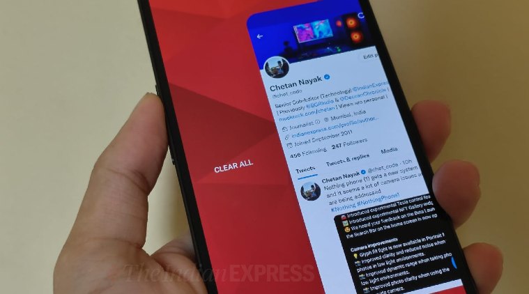 The default ‘Clear all’ button will only appear when you swipe all the way to the extreme left. (Express Photo)
There is a ‘Clear all’ button, but it’s all the way to the left, meaning you have to swipe a lot before you can use it. Alternatively, you’re left manually swiping away every app to shut it.
A simple and constant ‘Clear all’ button on the bottom of the Recent Apps page would make this task a quicker one-tap process. It would also be an added bonus if the Clear All text appeared in the signature Nothing font.
Granular Glyph control for notifications
It is no secret that the Glyph Interface is the trump card of the Nothing phone (1) against pretty much every other smartphone out there. One of the cool things you can do with the Glyph lights on the back of the phone is set up individual Glyph ringtones for various contacts so you can identify who is calling even when the phone is upside down and on silent. Unfortunately, this feature is not applicable to app notifications yet.
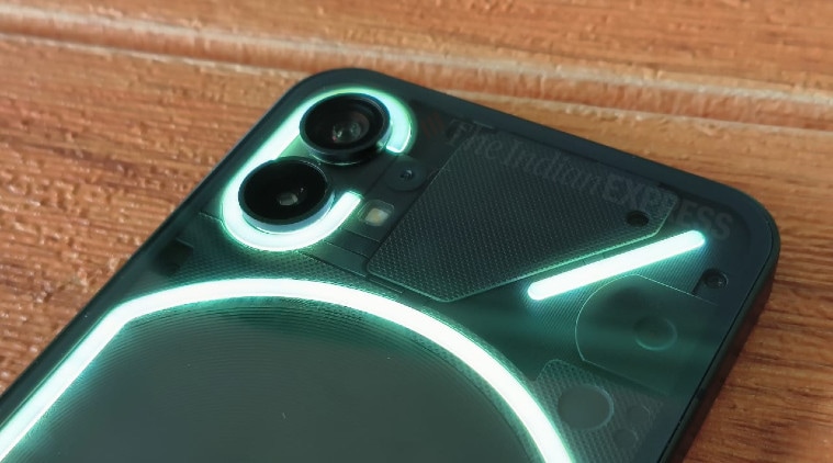 While you can customise the Glyph lights to a degree for different callers, you can’t do that for different app notifications yet. (Express Photo)
The Glyph notifications work in a similar manner, with a combination of sound and lights alerting you of a new email, WhatsApp text or your Amazon order updates. However, you cannot code different Glyph notifications for all the different apps, which would have been way more useful in identifying, which app is sending the notifications, without having to look at the screen.
A light Quick Settings panel in Light Mode
I almost exclusively use the Nothing Phone (1) and every other phone I have on dark mode only. The darker colours make the most of today’s AMOLED screens and also look pleasing to the eye. However, dark mode is one of the first toggles I hit when I head outdoors as that is when the ‘white text on black backgrounds’ could be difficult to read.
When I switched to Light mode on the Nothing Phone (1) though, I was shocked to see a two-tone look, with the Quick Settings panel remaining dark, while the rest of the UI goes white. While this may feel like an aesthetically superior look to some, it completely ruins using the phone outdoors for me. The fact that the Phone (1) doesn’t have the brightest display panel doesn’t help either. A switch for users to go between light mode, dark mode and the two-tone mode would keep all parties happy.
App locking in recent apps
App locking is one of the useful features found on pretty much every Android skin out there and this is a page Nothing could add to its Nothing OS playbook. App locking in the Recent Apps panel allows users to make sure the phone doesn’t wipe selected apps from the RAM, leading to a restart when you go back to them. App locking is useful when you have apps with background processes, that may automatically turn off/shut down when they’re not in the foreground for a while.
Bonus: Screen-off gestures and quick launch
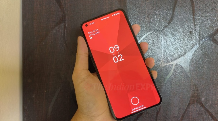 The Nothing OS lockscreen could really use gesture support to quickly get to favourite apps. (Express Photo)
Being an AMOLED screen with an in-display fingerprint scanner, the Nothing phone (1) can make the most of its display with a few screen-off gestures. These gestures, used on phone-makers like Oppo and OnePlus, allow users to quickly draw shapes or letters on the screen when it is turned off. These gestures can do anything from opening select apps to controlling your music playback.
[ad_2]
Source link


Leave a Comment